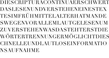
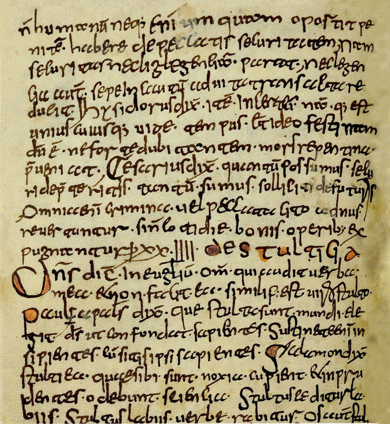
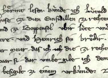
The Gothic script developed in twelfth–century France was used in Western and Central Europe. It was characterized by an emphasis on vertical, straight lines and sharp angles. The Gothic style was ousted in Southern and Western Europe by the humanist cursive or Latin script, developed in fifteenth–century Italy. Humanist cursive script is pretty close to contemporary handwritten script and is therefore fairly easy for people to read today. The neo–Gothic script based on the Gothic writing style developed in the German language area remained in use in Northern Europe until the nineteenth century. The neo–Gothic alphabet developed based on the Fraktur typeface which was always used in Germany until the beginning of the twentieth century. When Sweden broke away from the Kalmar Union, the kingdom strengthened its ties to the German language area and this was also visible in the use of neo–Gothic script from the 1520s onwards.
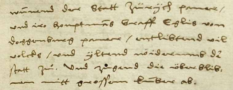
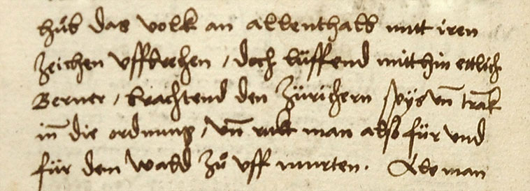
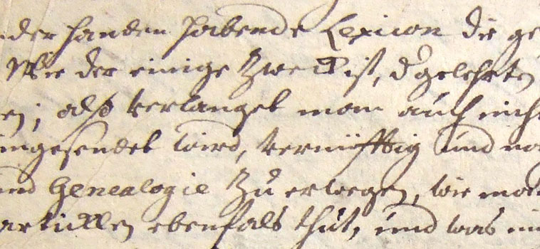
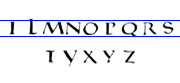
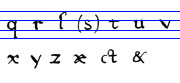
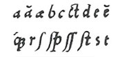
One distinctive feature of neo-Gothic script is that the final stroke of several letters was separated from other letters by an extra loop. This was usually done for the letters a, g, q, v, w, and y. Other letters too, such as b, l and t, may have had an additional loop. A few letters were distinguished from other letters by a diacritical mark above the letter. A curved dash was marked above the letters u, v and w. The letter y is difficult to distinguish from the combination ij, as two dots were also marked above a letter y. Often the difference can only be detected by the way the word sounds, although a number of scribes turn the stem of the letter y to the left, while in the combination ij, the stem of the j is almost straight. The shape of some letter combinations is difficult to identify at first in some handwriting. These include ff, fft, sk, ss, st and tt.
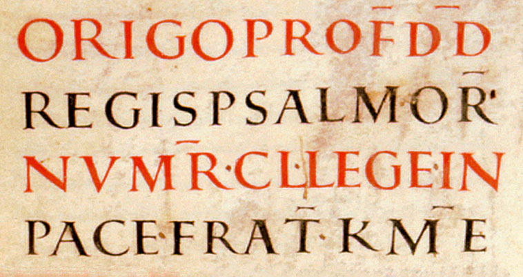
In the sixteenth century it was typical to abbreviate words from the middle. One way was to cut the word off in the middle and indicate the end of it with a wavy dash (suspension). The word could also be abbreviated by leaving out letters from the middle of it. The months of September, October, November and December were shortened, using the number and suffix –bris or –ber (7bris = Septembris, 8bris = Octobris, 9bris = Novembris and 10bris = Decembris). This was based on the oldest Roman calendar, in which these months were in positions 7–10. The fact that letters were missing from a word was indicated by a line above it (contraction). This was often still done for the double consonants mm and nn in the eighteenth century. Otherwise, the use of abbreviations declined in the seventeenth and eighteenth centuries. In addition, a variety of characters were used to describe letter combinations, words or measurement and monetary units. The hyphen (dash) used resembled today's equals sign (=). Capitalization was unstable: often it is impossible to say whether a letter is upper or lower case.
 Capitalis quadrata, around 830
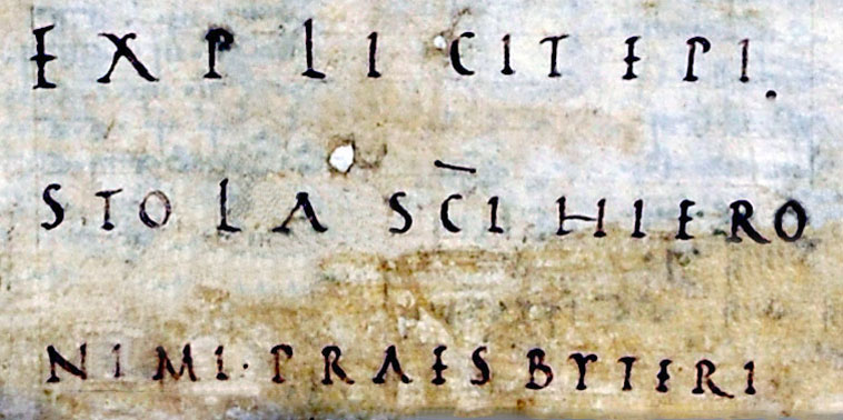 Capitalis rustica, around 830
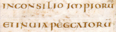
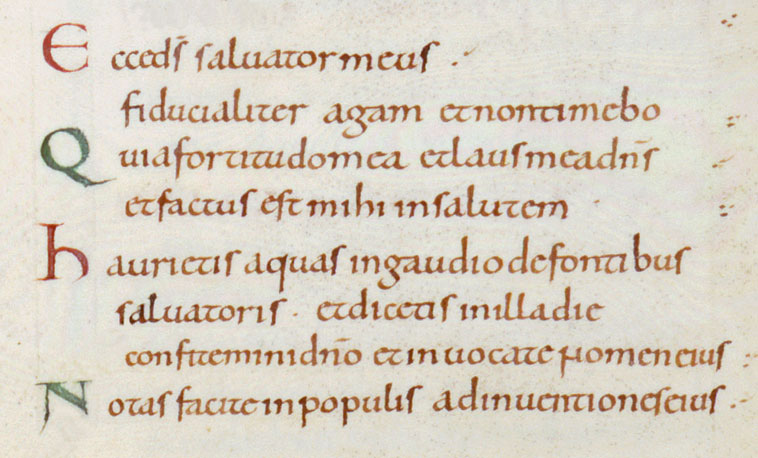
 Late Caroline Minuscule
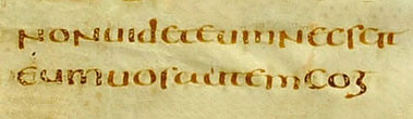
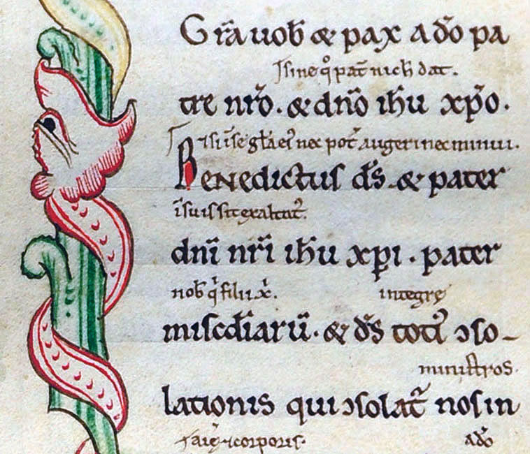
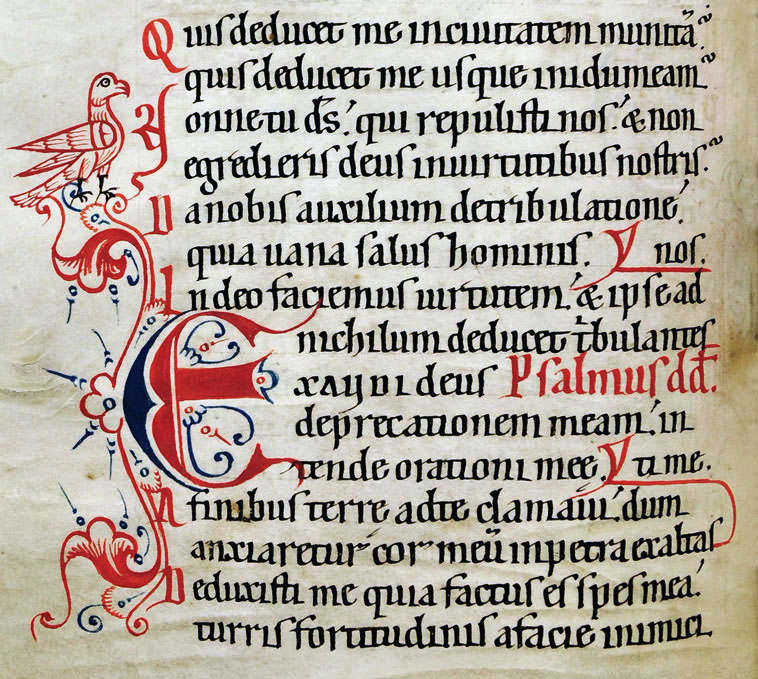 Early Gothic Minuscule
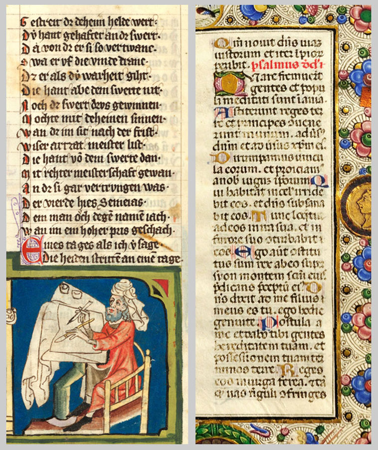
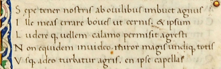 Humanist Minuscule